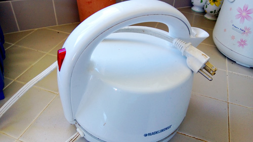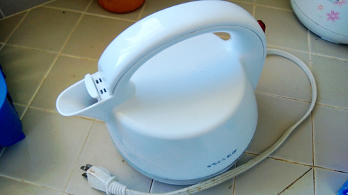
I was trying to boil some water the other day using this electric kettle. After spending two minute looking for where I can put some water in, I asked my friend K, the kettle owner.
“Hey K, how can I put some water into this kettle?”
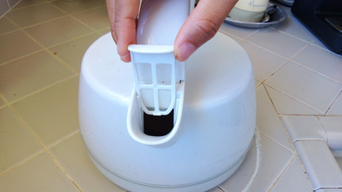
K took the small filter out, and got some tap water into the narrow spout, “there you go.”

Interesting.
I got the kettle from her and about to plug it in. “K, how do you know how much water you put in the kettle? I don’t see any scale here…”
“I don’t know! Maybe it won’t start if there’s not enough water? It’s supposed to unplug when there’s no water, isn’t it?”

I don’t know. But let me play with it a little bit more.
I plugged it in and pressed the switch and it was on.
“Ah! Actually let me have more water…” I pressed the switch again to turn it off. Nothing happened.
Pressed again. Still on.
I unplugged it. It went off.

Great! This is an excellent example for… what do we call it? Bad. Design. It complicates things. And it doesn’t even allow me to clean the inside!
I asked K about this kettle afterwards. She said “I got it a year ago from a hardware store. I thought I needed a kettle that can stop itself when water is boiled. This was the only one in the store, so I got it. It works okay.”
Oh well. This kettle forces us to learn how to use it in an unnatural, unpleasant way. I honestly hope to see fewer and fewer designs like this.
Design folks, let’s make easy tasks easy, and complicated tasks easier!
* * * * * * * * * *
Everyday UX:
Here I capture things with delightful or painful user experience in everyday life. What things are wonderful to use, and why? And what are a pain in the neck?
Any ideas on how to improve our lives is greatly appreciated! Let me know if you have something to say, too.
* * * * * * * * * *
Interesting topic! I also like to observe details like this in my life~
Write them down :)