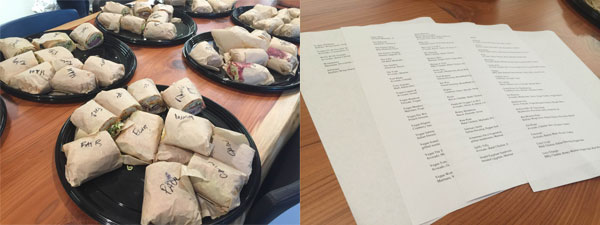
Today, we had a catered lunch: three trays of sandwiches. On each sandwiches’ wrapped paper, it was kindly marked a “sandwich name” by pen.
When I was about to grab one, I had no clue just by looking at the names, such as “SJ”. Yeah it gave me a name for this sandwich, but did it help at all? No, it didn’t tell me what’s inside, didn’t indicate which ones were turkey, ham, beef, veggie or vegan – no useful info.
My coworkers helped print a 4-page menu from this restaurant, so that we can find out which sandwich was which. However, the items on the menu didn’t match the handwritten sandwich names. Ughhhhh… A perfect example of frustrating user experience.
I believe the restaurant had good original intention of making good sandwiches for people to enjoy, then there were these things that made my eater experience complicated:
- There were at least five or six different types of sandwiches with confusing names that paralyzed my decisions on choices.
- The menu print out didn’t explain what these sandwiches were.
That really gave me a lesson on user experience: if we want to build a product or a service, we do not only need a great intention, but also make it work for users, easily, and hopefully with delight.
Think about a good overall experience, from beginning to the end. Try the whole experience by yourself. Get feedback.
I ended up going away with a sandwich named “Bad Bastard”, well, cute name for a sandwich, I would say.