Meet Jen, an insurance agent and Hearsay user

Six years ago, Jen made her way into the insurance industry and started an agency. She grabs every opportunity to promote her business.
She knows that social media is important to get prospects, but it’s not easy to keep up — she spends most of her time doing paperwork and addressing customer needs. Therefore, social media becomes lower in her to-do list.
She is able to post more often after joining Hearsay Social, where she can select and publish compliant posts created by her corporate marketing team. She subscribes to her corporate social media campaigns every month.
Jen wonders what can be done to make her life easier.
At Hearsay, we asked ourselves:
How might we help Jen, as well as thousands of insurance agents and financial advisors, stay active on social media, while spending most time connecting with their clients personally?
My role
As the design lead for this project, I worked closely with my product manager and engineers from the very beginning. Together, we’ve revamped our mediocre campaign to be a dynamic, scalable social media automation powerhouse. It has become one of the fastest adopted features and helped the company hit the Shared Strategic Goal within nine months.
Sample Before/After Pages
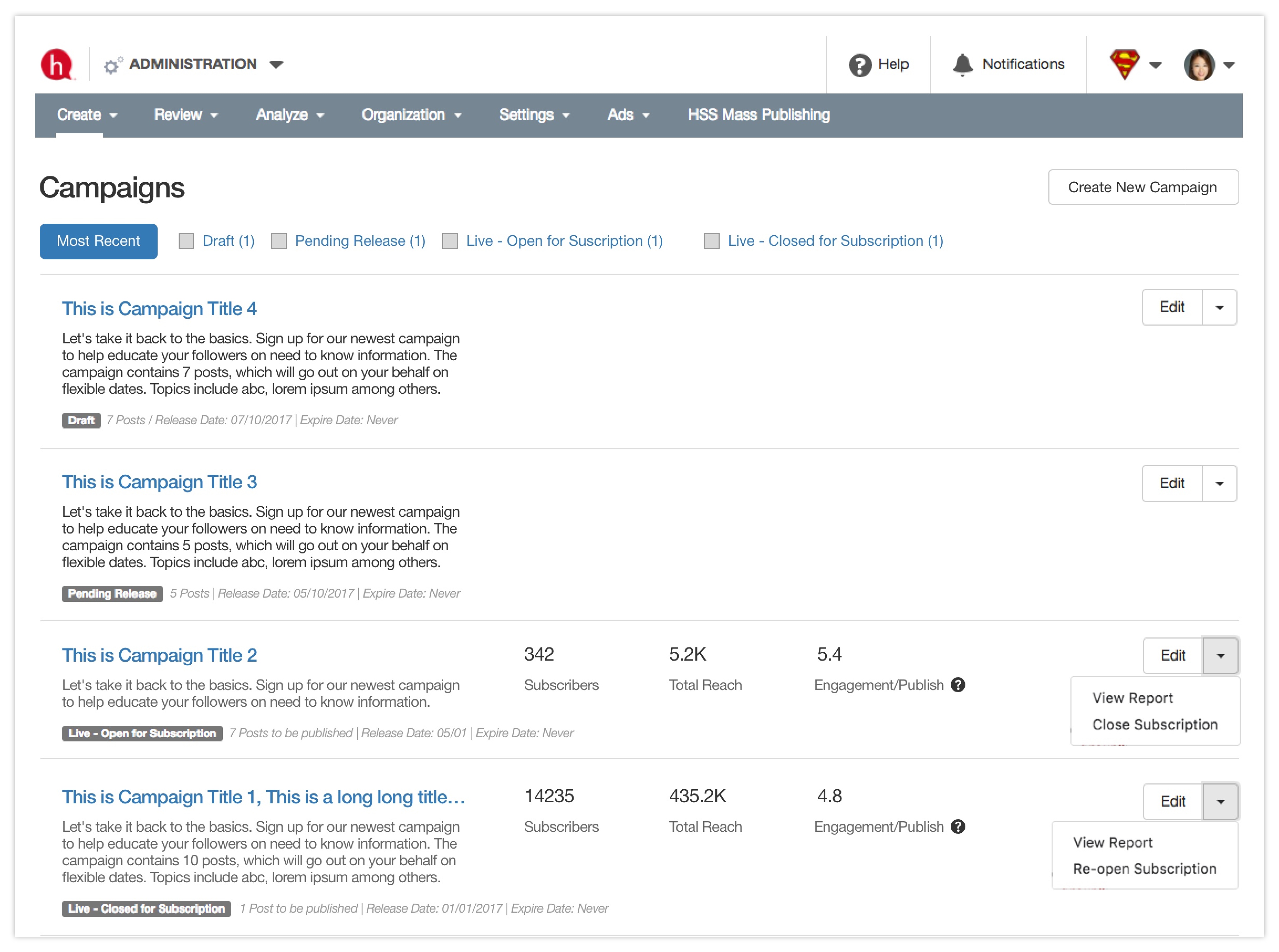
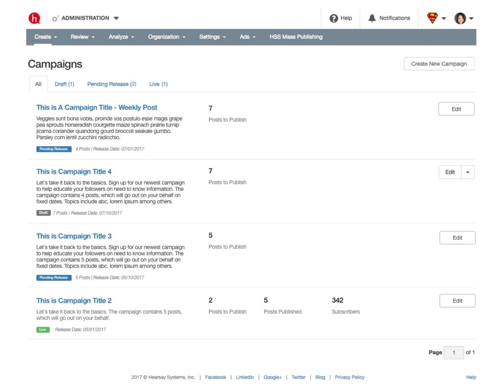
Campaign List – Campaign Creator
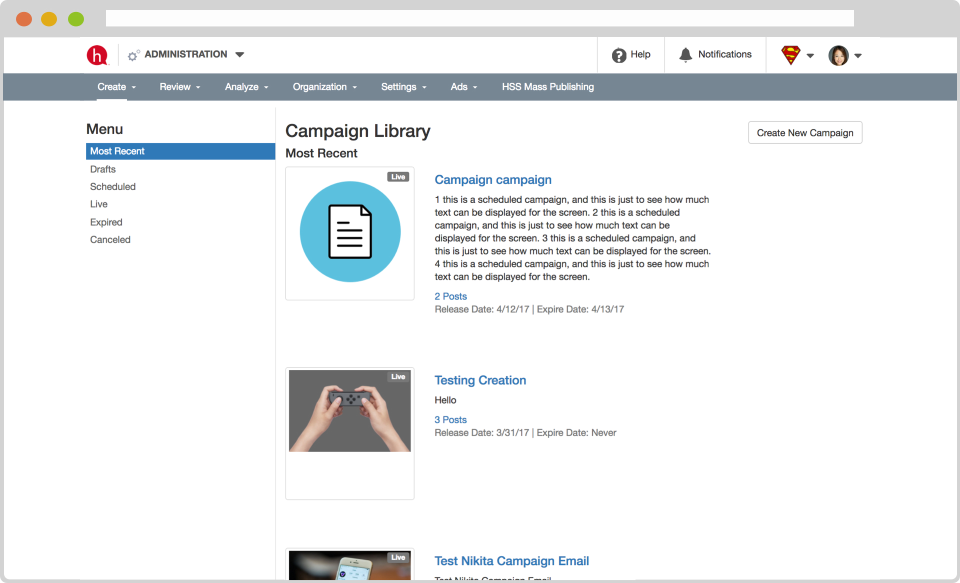
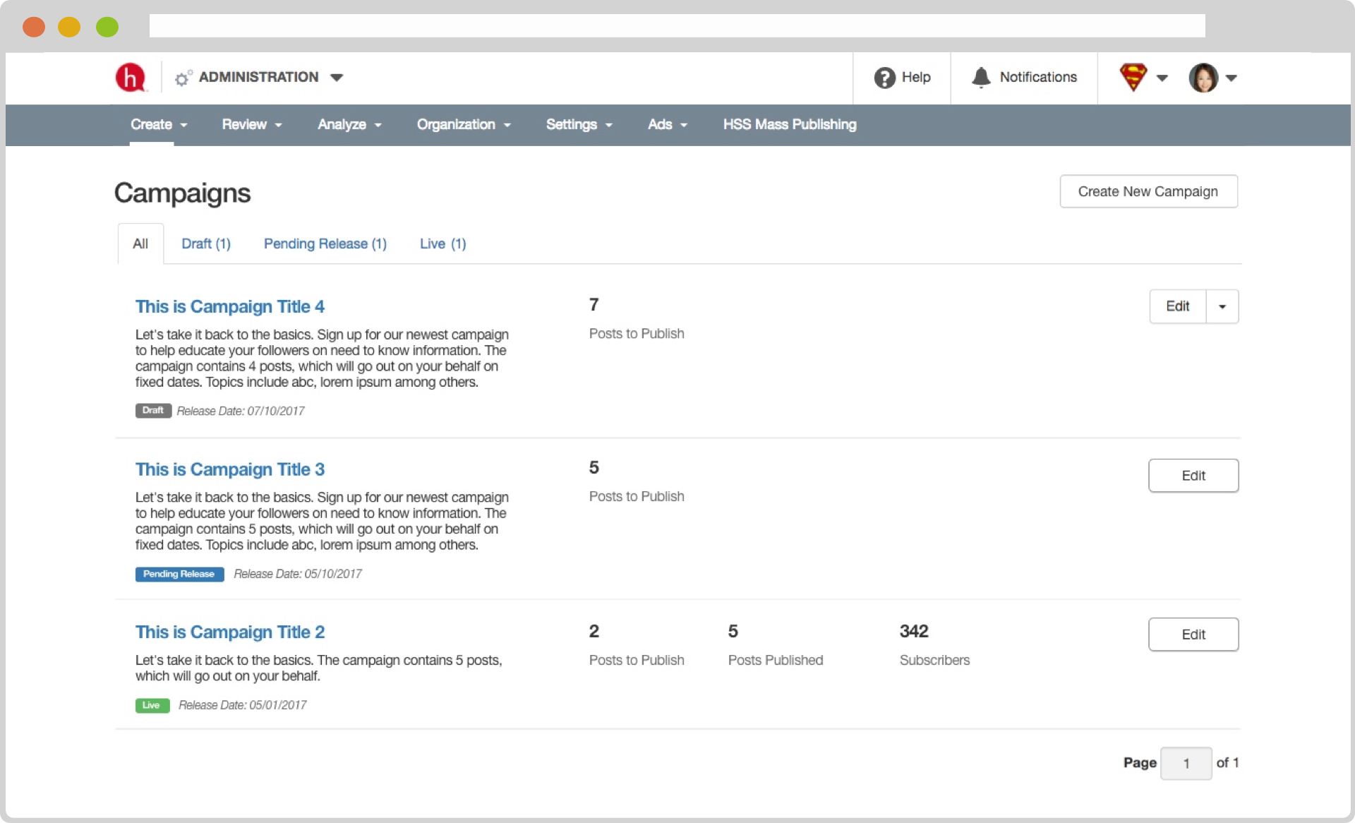
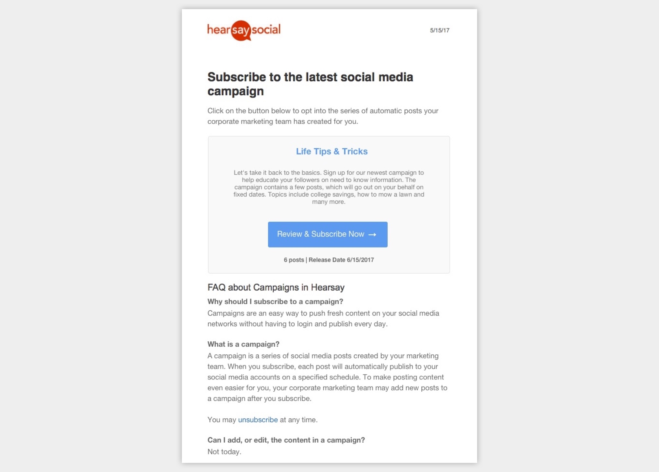
Campaign List – Subscriber
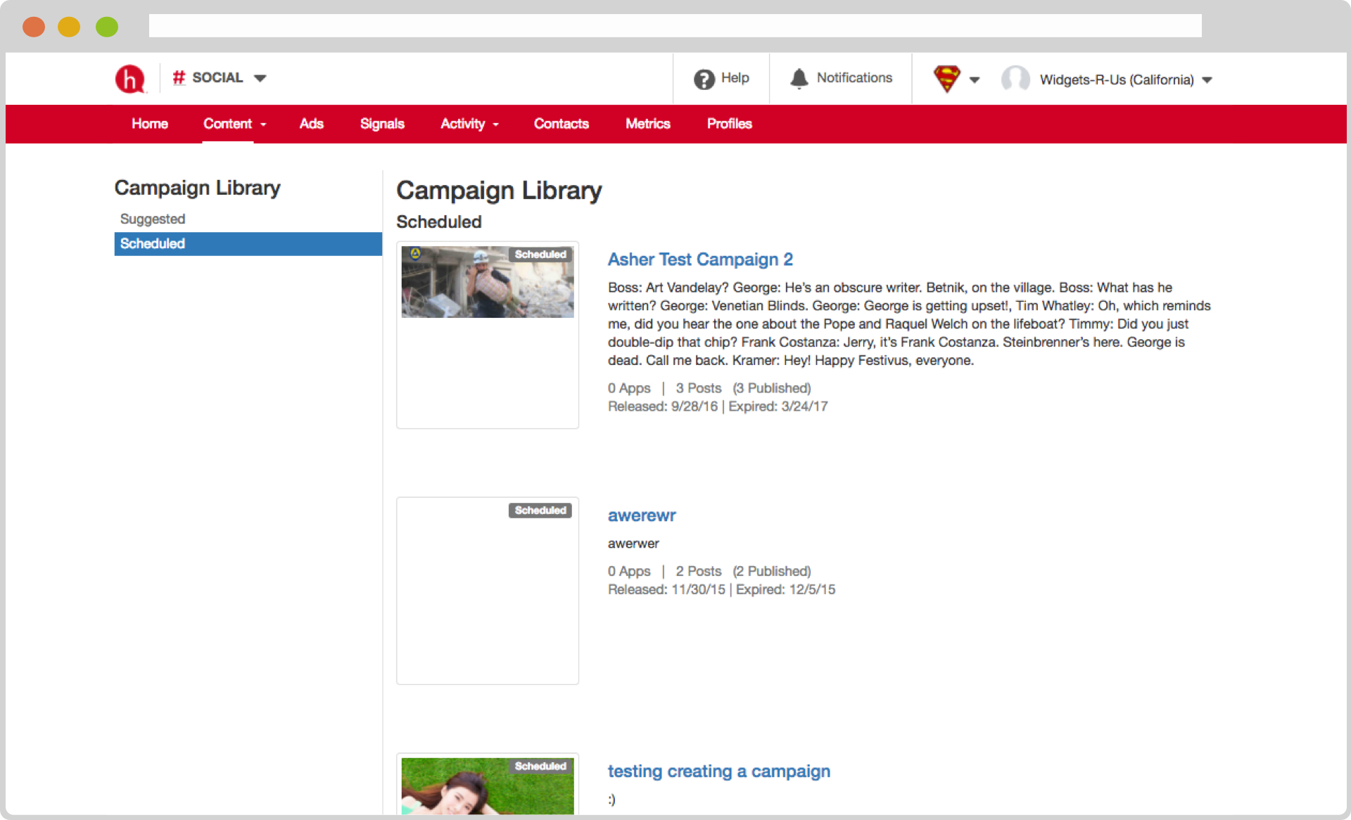
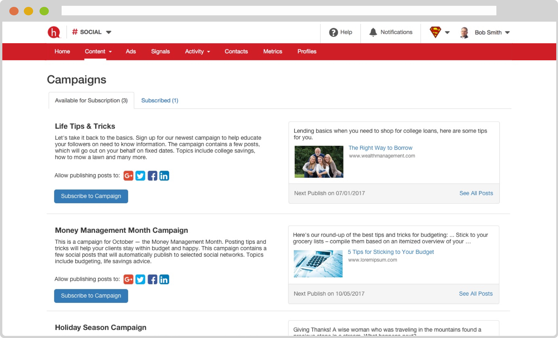
Initial hypothesis
After diving in what’s already in Hearsay, my product manager suggested looking at the existing social campaign feature. It was built with the intention of automating social media publishing, however, customer adoption was very low.
User feedback provided more insights:
— An annoyed financial advisor (campaign subscriber)
— An exhausted corporate marketing admin (campaign creator)
Indeed, every released Social campaign was like a launched rocket, no further modification was allowed. The existing campaign worked just like how other digital marketing campaigns work, but that’s obviously not working for our target users.
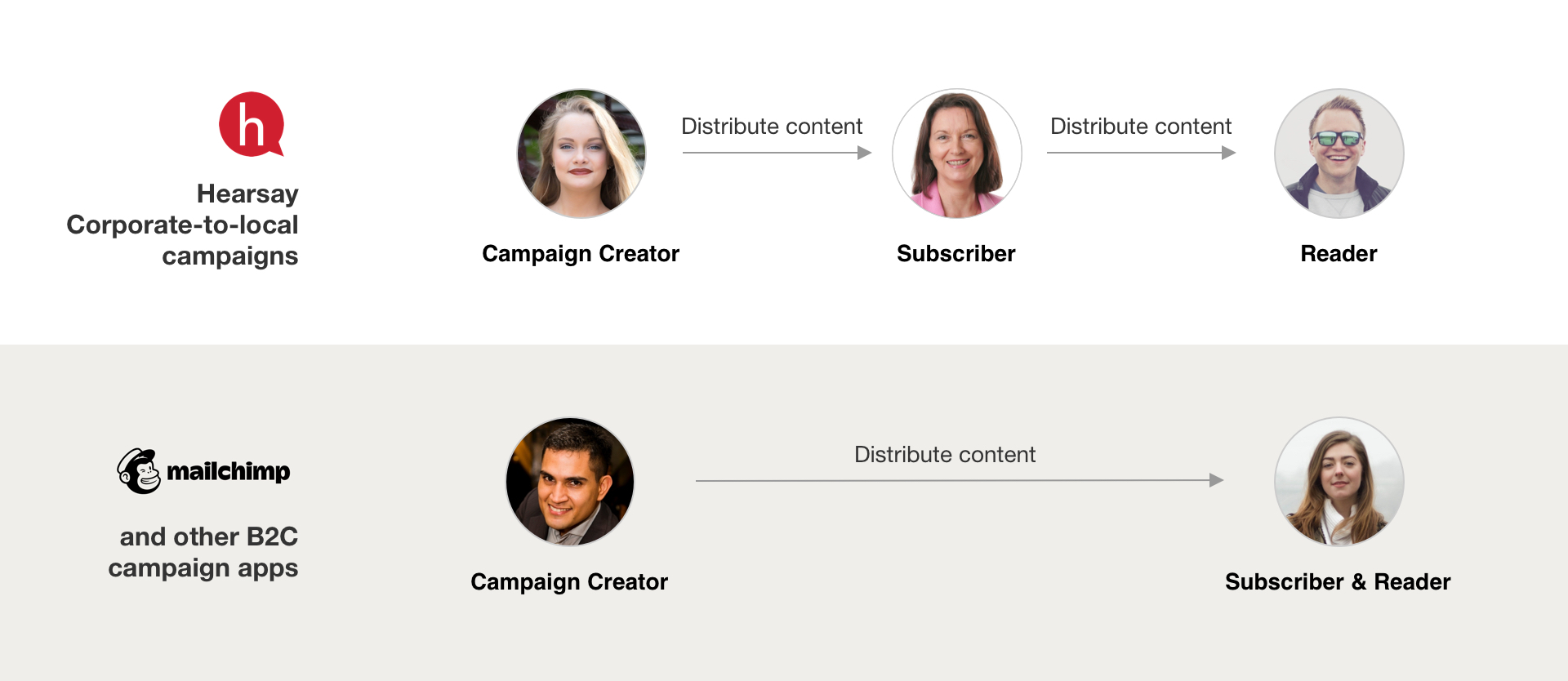
The hypothesis: what if we make every campaign a never-ending content publishing stream?
We were onto something, but was it the right path?
If the hypothesis was correct, we would see needles moved in:
Customer adoption
By continually adding content to a campaign, agents/advisors can stay active on social media. Customers love this.
Agent/advisor weekly publish rate
Subscribed agents/advisors will have content automatically published to their social media at certain cadence.
Number of active Social users
This potentially attracts more agents and advisors to activate their Social accounts.
Both the engineers and I were very new to the Social product. In addition, none of us knew how campaigns were used. To better understand the problem, I invited 10 campaign creators to talk with the team on:
- How they plan campaign content
- Pain points of using existing Hearsay Social campaign feature
The results:
- They really wanted to drive agents/advisors social media presence from the corporate side
- Although they had different practices, released campaigns at different cadences, there’s a lot in common in how they used it
- Not able to add posts to a released campaign was painful. Lots of manual efforts went into duplicating campaigns
- We received extremely positive feedback on the hypothesis. They were willing to give us feedback once we had designs
Our customers wanted it badly — what did it take to make it real?
In parallel to the customer conversations, the engineers and I evaluated efforts to turn our hypothesis into reality.
Technical
The architecture was not designed to support the desired campaign subscription model; the frontend was hard to build upon.
Design
- Lack of communication on value and benefits to users
- Unnatural and fragmented user flows
- Redundant pages
- Slow page loading
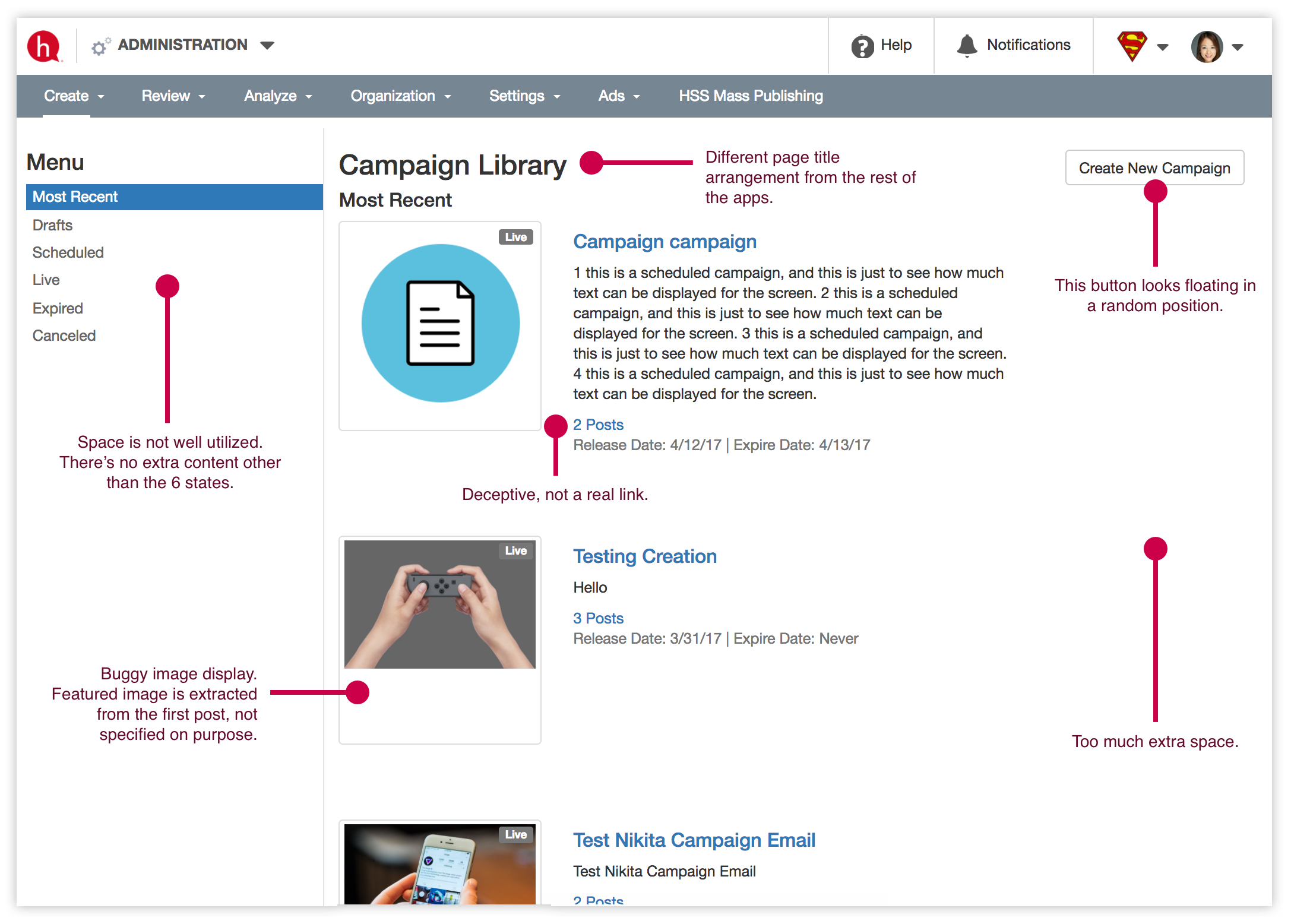
- Whitespace not effectively used
Click the image to view existing campaign →
The conclusion: it had to be a complete overhaul.
Enter the design phase

Entering the design phase, I set up a weekly routine to check with my team. We use the time to review design and implementation as a group. The engineers started working on the backend, and I wanted to make sure their changes can accommodate future design directions, and make sure designs were ready for them when they needed them. Throughout the entire project, we stayed on the same page.
Divide and conquer
Revamping the campaign required work for two types of users: campaign creator and subscribers.
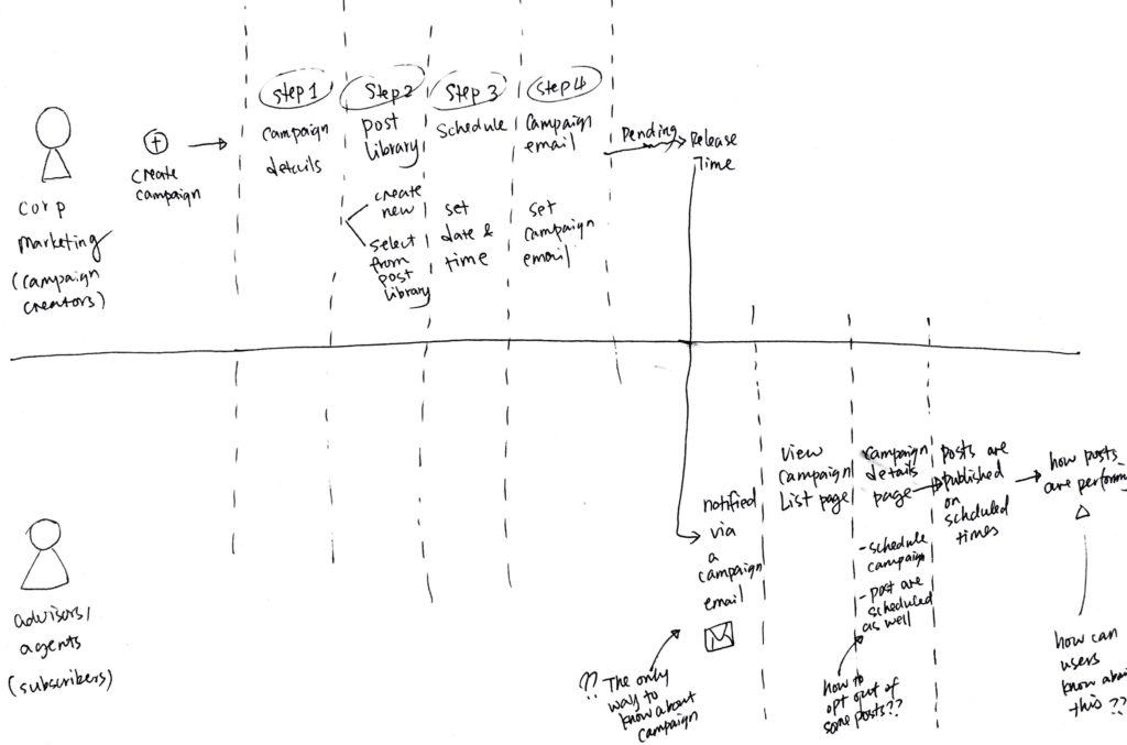
The campaign creator experience (priority):
The major revamp area. Everything had to be built from scratch, including backend, frontend, and UI.
The subscriber experience:
With existing UI and architecture, things can work. We should improve this if there’s capacity within the project.
The iterative design approach
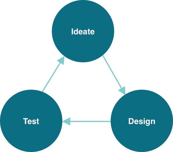
I used an iterative design approach to ensure:
- Exploring a variety of options before settling on a design direction.
- Getting our designs in front of users as soon as possible.
- Incorporating learnings from users into the next round of design.
The campaign creator experience — Valuable. Efficient. Familiar
Learn all about the existing campaigns
Audit existing info, actions
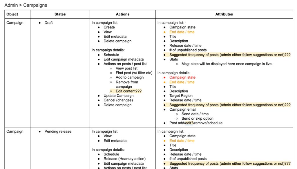
Map scenarios, actions
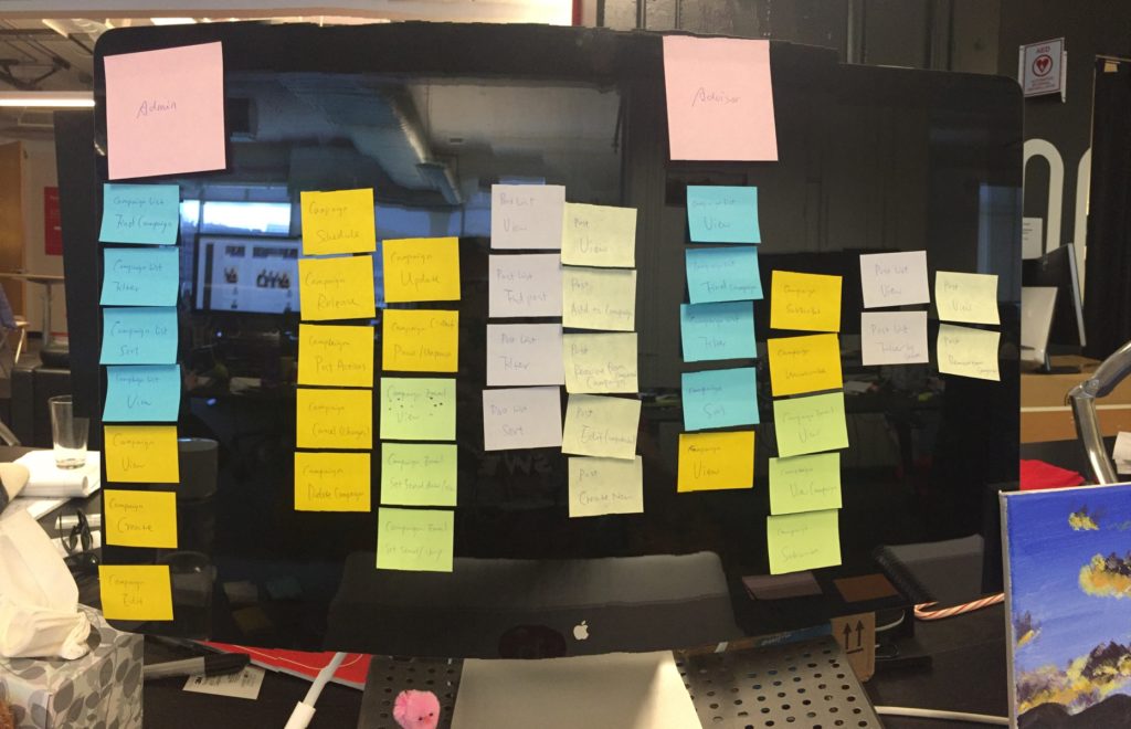
Ideate / Design the first version
Homepage – where the value shows
The campaign creators needed reasons to come back to the Campaign feature over and over again. After researching a number of popular campaign apps, I learned that displaying campaign metrics helped to inform users of its value.
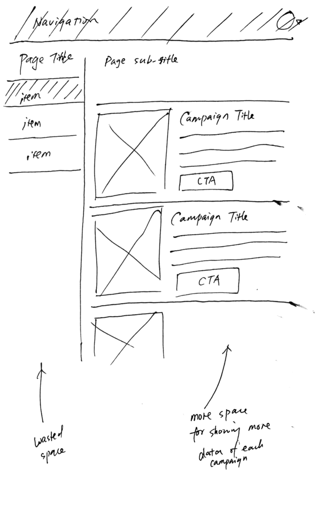
To do this, the existing homepage desperately needed a facelift. I explored layout options and quickly ruled out ones that didn’t work.
Create Campaign flow
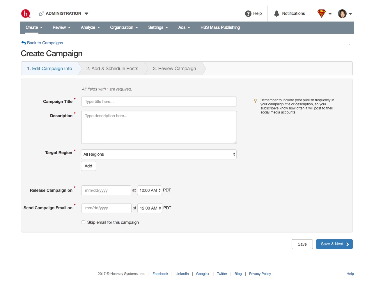
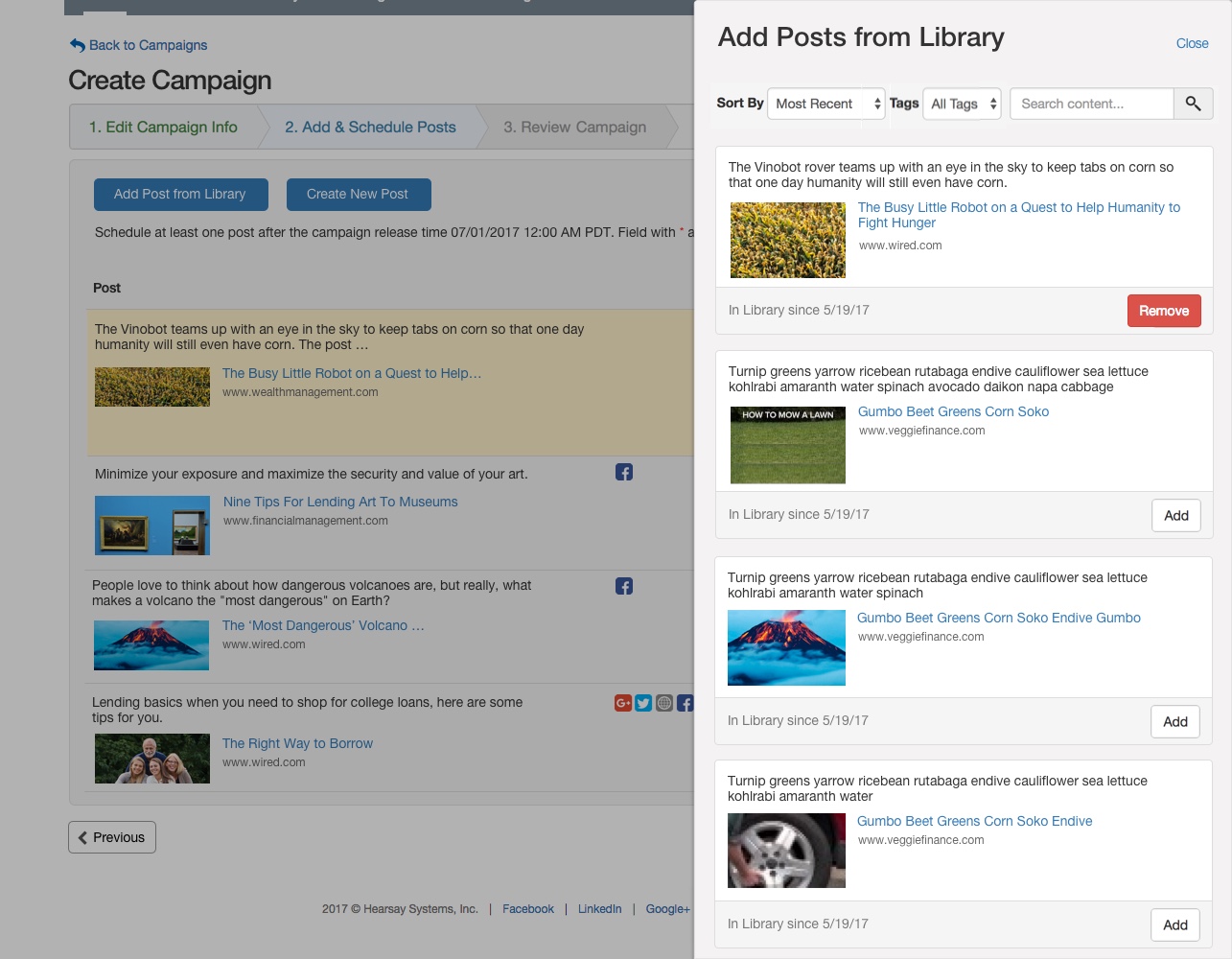
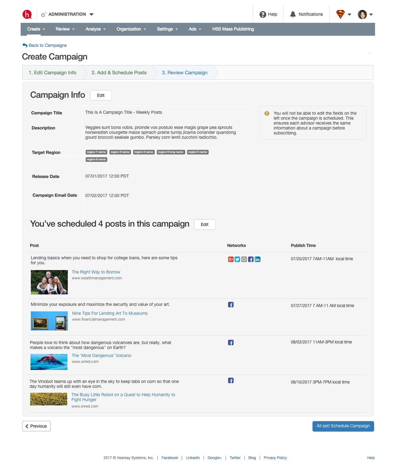
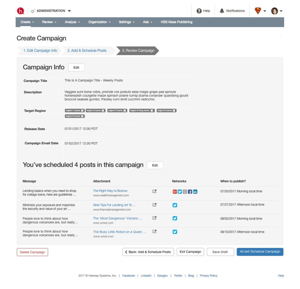
I straightened out the campaign creation flow, so that it: 1. reduces redundant steps; 2. gives users more confident when releasing a campaign; 3. can be extended to the “update a campaign” scenario.
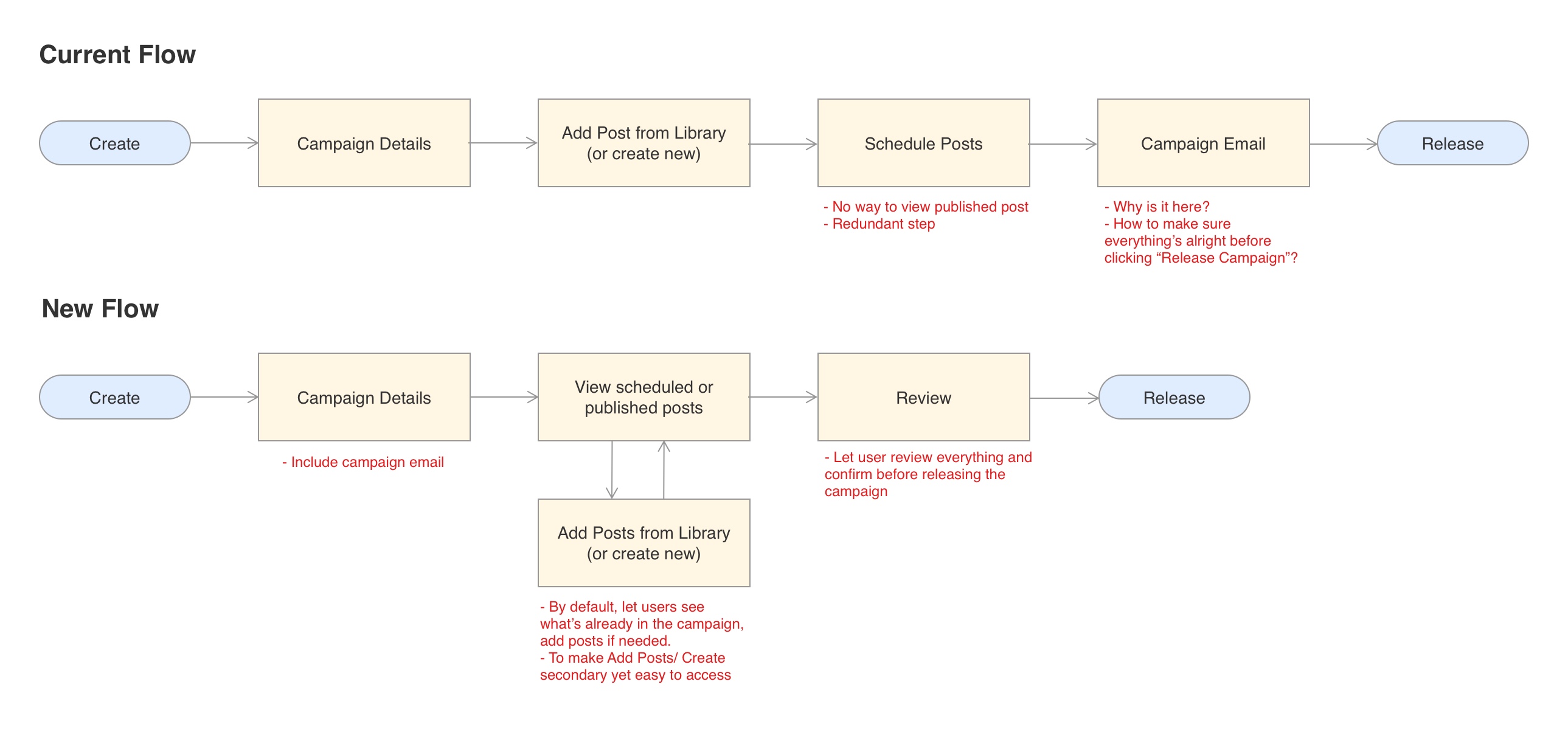
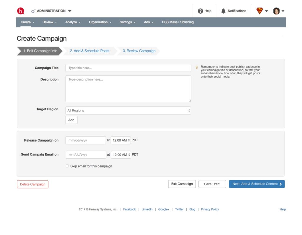
I experimented with different layouts as well as interactions, and temporarily landed on a design direction, so that I can conduct user testing with them.
Edit Campaign Info
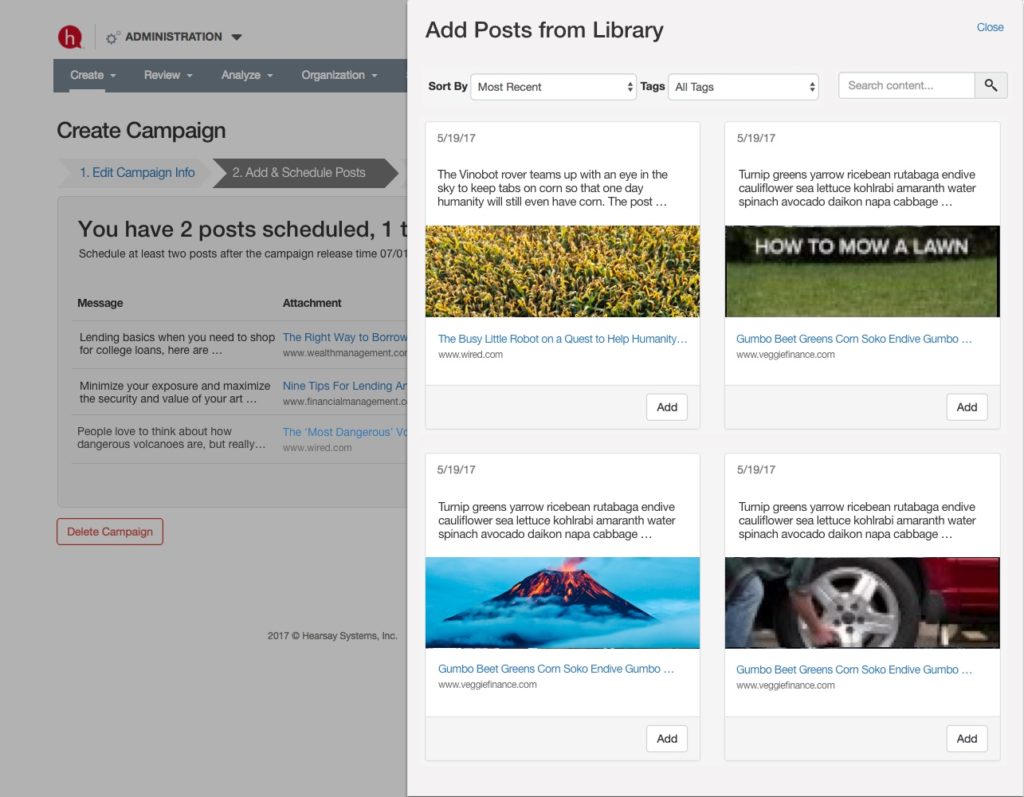
Add & Schedule Posts
Review Campaign
Prototype / Test with users / Iterate
I made my designs into a clickable prototype and let 7 campaign creators play with it. I scheduled the sessions across a period of two weeks so that I can iterate in between them. I asked my PM and engineers to attend the sessions and get first-hand feedback.
I observed:
- whether they were able to create and update a campaign on their own.
- whether they were able to recognize the value of this feature.
- whether there was anything else they wish to have.
Important feedback for iterations:
- It was great to see all of them complete all the tasks. They had trouble locate posts from the Add & Schedule Posts and made some suggestions.
- Having metrics on the homepage was great, but it should be easier to understand. They wanted more detailed reporting.
- It should be easy to save campaign changes.
- We planned to cut the “Cancel Campaign” feature from MVP but it turned out to be important.
Final design (click to view ↓)
The subscriber experience — Effortless
The existing experience required users to click through a few pages in order to subscribe.

I tried a variety of ways to make the existing campaign list and details nicer, but none of them was satisfactory — users still needed to go through different pages to subscribe.
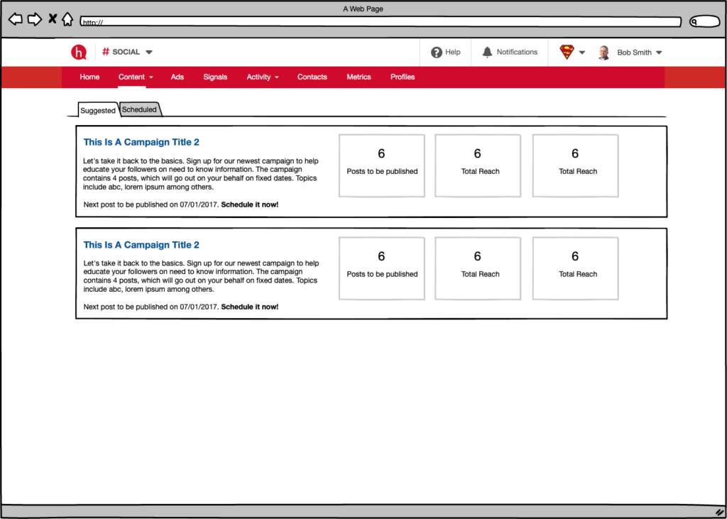
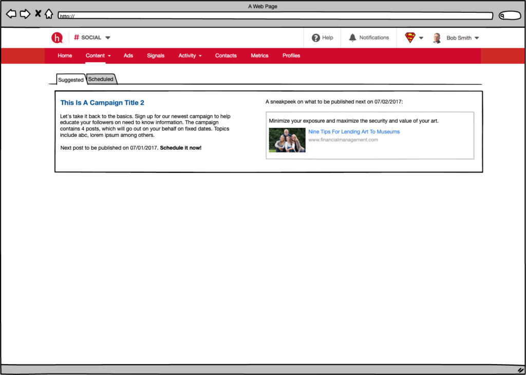
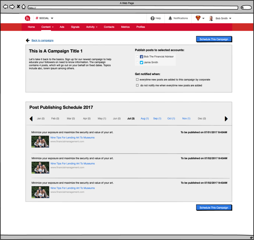
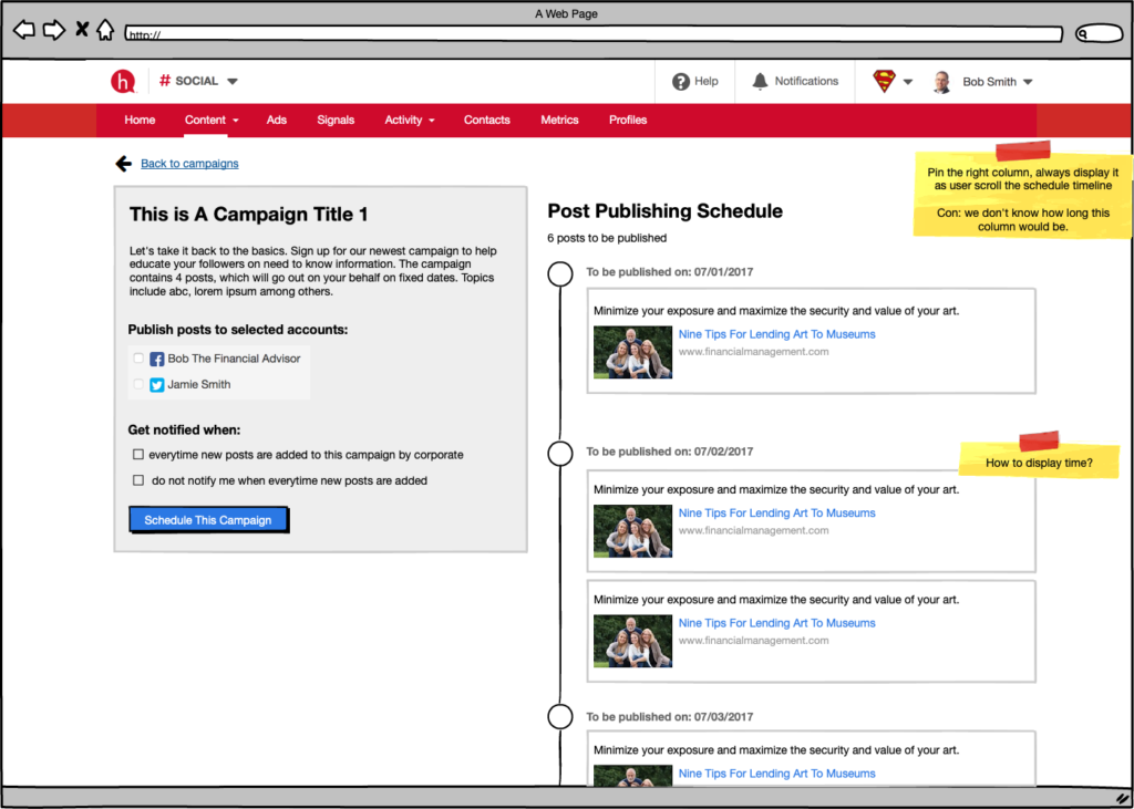
I changed my focused to simplify the flow. After all, what the subscribers wanted to do was “subscribe” — whatever can make it fast to come in and out quickly.
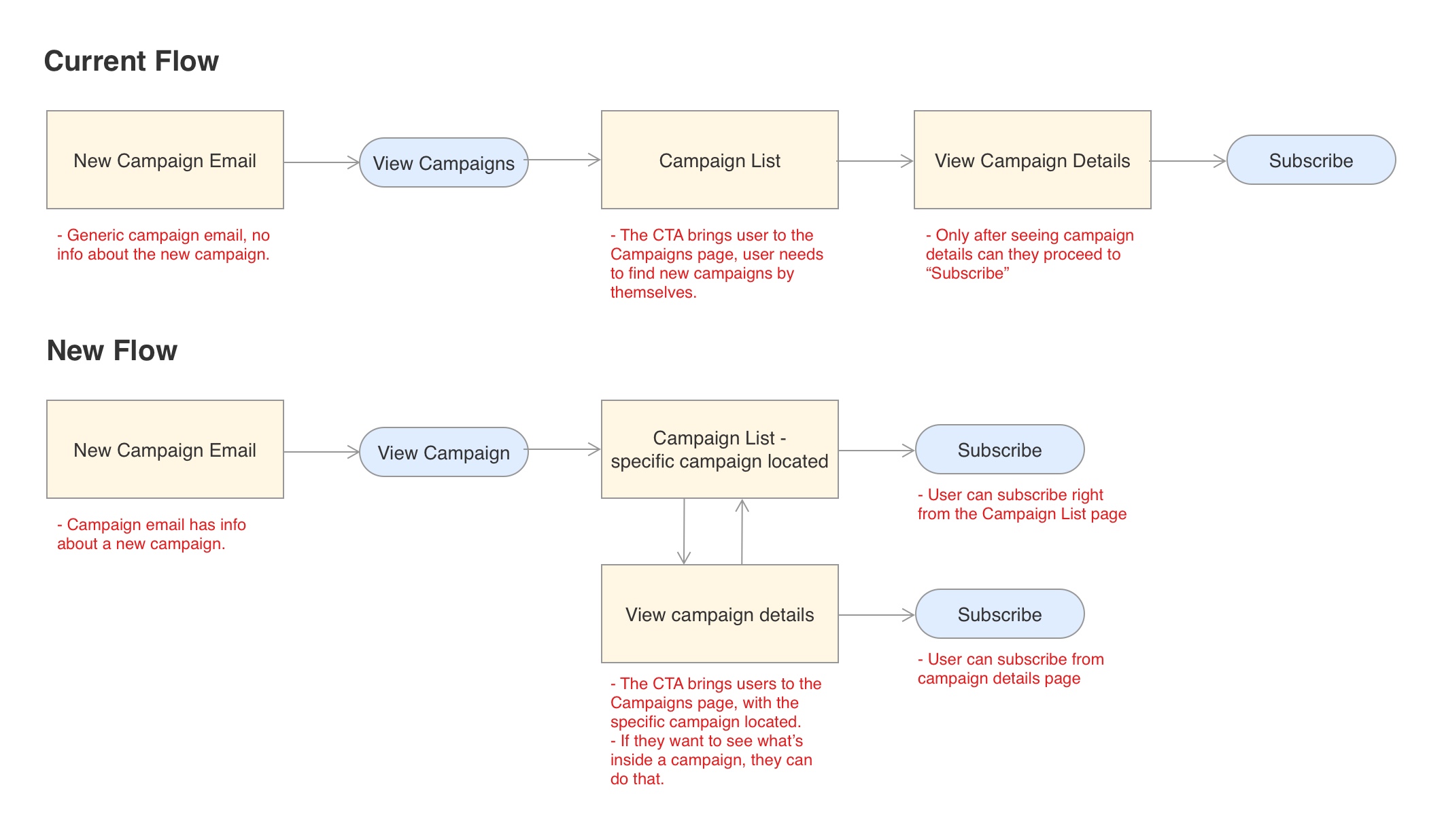
After testing with 5 users and a few iterations, I landed on the final design. This solution allowed users to conveniently subscribe to campaign on the Campaign List page. They can subscribe to as many campaigns as they want, all within a few page scrolls and clicks.
Click the image to view subscriber final design →
We launched the campaign!
The campaign creator functionality was released in December 2017; the subscriber functionality released in January 2018. We saw amazing customer adoption and usage.
Within 3 months:
- Rolled out to 50+ customers
- ~300k posts schedule or published
- 5 customers with > 60% subscription to the campaigns
Within 9 months:
- Helped Social product hit its SSG
- Increased weekly publish rate from 26% to 35% and continued to increase
As of Oct 2019:
- Rolled out to almost all customers
- 800+ campaigns created
- 40k subscribers
Think of Jen again

Jen subscribed to a few campaigns. She can focus on her core business needs and at the same time stay active on her social media forever.
Learnings and follow-ups
Learnings
- Customer needs and hearsay business needs we well aligned
- User focused design was introduced to the team, everyone (Eng, PM and Design) got to meet with users
- Final solution evolved through everyone’s input – a healthy mix of design, PM input and Eng input focused on the user
- Customer rollout took time, the impact was slow to show. Therefore, next improvements didn’t followed up in time
Follow-ups
- Within 6 months, we launched another type of campaign to accommodate more needs.
- With the new design system rolling out, the campaign UI will be upgraded to be more modern and visually pleasant.
