For website users, first-glance impression might be very important, especially when there are many similar-function websites for them to use. Usually when we know we have many available and similar resources, we become somewhat critical. As Kristina Halvorson mentioned in her book Content Strategy for the Web, if users are not satisfied at first, they simply go.
For websites, it is like “love at the first sight”. People may endure the interfaces at first, even if they don’t like it so much; but if it is hard to use too, they, like said above, they go immediately for other sites.
Here I have 3 websites for house searching.
1. HomeHippo
 HomeHippo: http://homehippo.com/
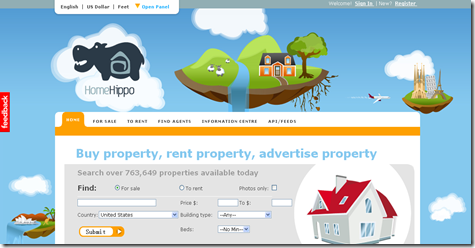
The Hippo site is cute. However it seems to be a bit over-cute, especially in the header. When I came to the site I saw the header but got no idea where to click in a second – a bit too complicated as a header.
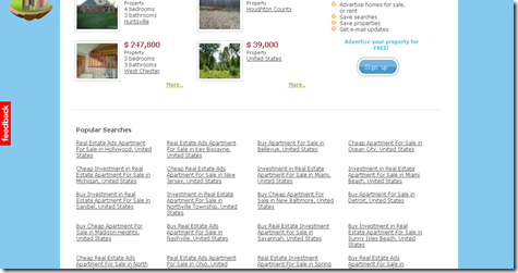
I scrolled down and find it listed all popular searches. Too many texts may give visitors a feeling of overwhelmed, thus I think this is not a recommended way to design like this. After I hung out for a short while, I choose to leave for the next site. I think the reason for my leaving is mainly because of the complication of the interface.
2. Hotpads.com
 Hotpads.com: http://hotpads.com/
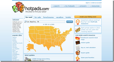
This site is much more clear, and have mild background color which makes my eyes very comfortable. The large US map got my attention immediately (huge color contrast), driving me to how this site work curiously. I think this is a great technique, and is used properly in this site.
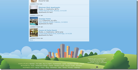
Hotpats also has a cute style (Similar to HomeHippo), but making it more neat and simple. It leaves the buildings at the bottom of the page, outside the content, and keep all content in the blue sky. I love this style and would like to explore its usage if I am a visitor for the site.
3. Trulia
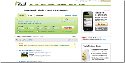 Trulia: http://www.trulia.com/
This is another neat site that brings me great visual experience. The content on the page is very organized, with the main searching box and results on the left and advertisements on the right. Colors for this site are not that many but very clean and clear. This is a good design that makes visitors want to continue to use.
Thank you very much for your interest!