I am a fan for WordPress.
I have been using WordPress for years. I keep being amazed by its powerful platform, functionality and constant improvements. Recently, WordPress 3.3 came out and Mashable has a great article about its 11 major improvements. The improvements are diverse, mainly new changes on the interfaces, such as the new admin bar, tooltip, media uploader, fly-out menus; of course, some functionality improvements as well, e.g. new Editor APIs. More improvements are expected in v3.4, and I am really looking forward to it:)
As a UI/UX designer, WordPress is one of my great sources for new ideas and patterns. When got stuck, stopping work for a while and browsing these great patterns is a great way to get new ideas. We don’t necessarily always invent new. Knowing how to use existing good design patterns is not easy, either. Actually, if one wants to become an expert in using existing patterns in right place, he/she needs a lot of practice, too.
Let’s take a look at the patterns I love in WordPress. I am currently using v3.2, so screenshots would be a little different from other versions.
1. The Dashboard
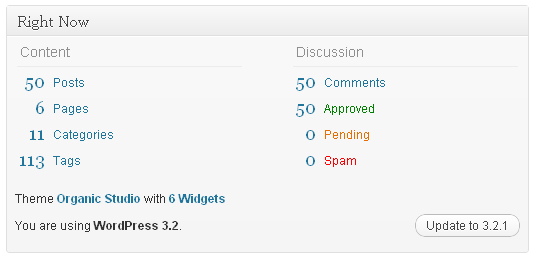
(click to see large dashboard image)
I just LOVE the dashboard. Well, in terms of designs a dashboard is easy, just throw content summary views to a screen. But the things is, what summary views should you display? Yes, it’s kind of an architecture thing, but it’s the key for usability, which is a concern in design, too. Let’s focus on content first, then design.
I especially love the summary view above (I admit there are a lot of content on the homepage I didn’t even glance, such as Quick Press, or WordPress Blog). But this summary view is so organized: posts, pages, categories, tags, comments (approved, pending, spam). I think every bit of it is so important to me.
But a summary view only is not enough, you may want to add more details for a specific section, just like what WordPress does for comments (it has a latest comments section). So keep in mind what content you should display for the dashboard, that’s important.
2. Mouse-over Menu
When you hover mouse on an item, such as this link bar, your mouse icon becomes “move”, and the menu “Configure” appears. This is smart. Hiding unnecessary menu bars could free our eyes. This pattern is especially useful in table format: when same menu items repeat for each entry, this is a great way to simplify their look.
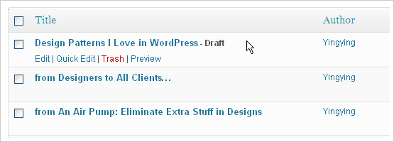
Same pattern is used for posts/pages:

Make menu quick and easy to access. This is absolutely one good way to do it.
3. Drag-n-Drop Menu Components
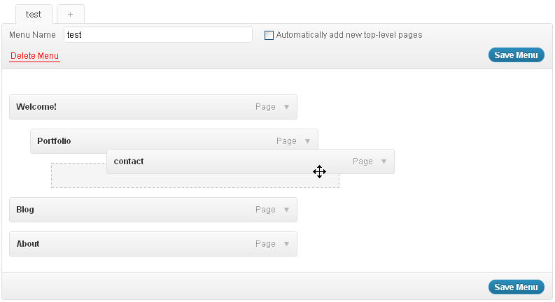
Drag-n-Drop to change your menu item order. Easy-to-understand, easy-to-use, and of course if you want to apply it to your design, try to make sure it’s fast and responsive, too. People don’t like delays when doing dragging:)
Ok, above are the WordPress patterns I love most. As designers, it’s an important skill to utilize the existing patterns. If I come across more good patterns, or website for patterns, I’ll put them here for sure:)


Very nice site!
Thank you very much!!
The very first time I met the Drag-n-Drop method was in iGoogle. It is very interesting to let users participate to arrange items in a way they like .
It’s a common way to improve experience for users now. I was excited that my first task at work to design the application in such a way. Very good practice.
well worth the read. I found http://www.yingyingz.com very informative as I have been researching a lot lately on practical matters such as you talk about…
Hello there, just discovered http://www.yingyingz.com on Yahoo, and found that it’s really awesome. I’m gonna watch out for brussels. I will appreciate if you keep writing about this subject in future. Lots of people will benefit from your writing. Cheers! good luck!
That is a really good tip especially to those fresh to the blogosphere.
Simple but very precise information Appreciate
your sharing this one. A must read article!
You can look for some free hostings like wordpress.com, and they will provide you very nice templates. Choose one and start blogging :)
Though the negative aspect of acquiring a band online is
actually that you can not examine the this literally right before buying.