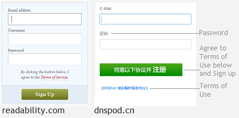
Recently, my friend showed me 2 websites sign-up pages that have one single password entry – readability.com and dnspod.cn. This was my first time to see a sign-up process without re-entering password.
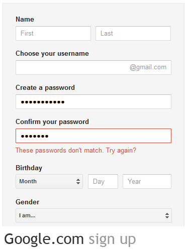
I then checked out several websites, such as Google, Amazon, etc, all of which have two password entries. Below is Google’s sign-up page.
This is an interesting issue. My friend said one password entry is easy, and good for users to sign up quickly; I held a different opinion though – one password entry may save time during sign-up, but users also lose the opportunity to validate/confirm the password. For example, a user wants to enter 123465 as password but inputs 122465 by mistake. Does he know there’s a typo by accident, will he try several times with frustration and finally click on the “Forget Password” link? I think it’s fairly easy to type wrong information – sometimes we type too fast, this can happen especially when we type frequently used information, like password, address and phone number. For passwords, as they are masked texts, we don’t know whether we make them wrong. Thus, personally I would rather make sure my password is correct at the sign-up stage, than putting something that might be wrong there. If I do use the one-password entry, I may end up spending time digging the right password or using the “Forget Password” link in the future.
Actually, it’s hard to tell right or wrong for these designs without data/statistics, I think this is when we need to do user tests to gather some solid data. Need to always remember, we designers are not end users, do not just use our imagination for design. Use data.


我想,我是来学英文的···
哈,加油!