A typeface (aka a font family) is a set of fonts that share common design features. For example, Times New Roman and Arial are different typefaces. Times New Roman is commonly used in newspapers; Arial is commonly used on digital interfaces. There are many other beautiful typefaces out there for people to use.
To choose the best typeface for your use, say, a brand name, you need to consider this typeface’s denotation and connotation.
Denotation focuses on pragmatic attributes — do you want your brand to look modern, traditional or classic? Do you want it to look thin or heavy? Do you want to print it on a variety of materials — does the typeface you like look good on large or small scales? You can probably narrow down your selection range with all these questions.
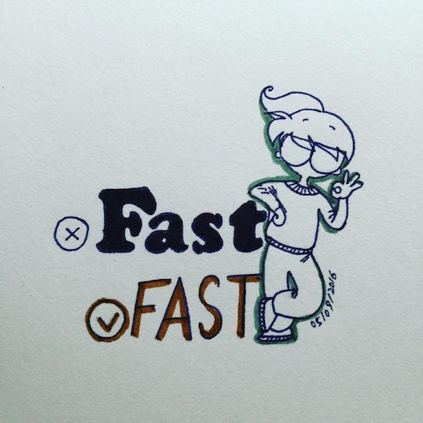
Next, play with the typefaces of your selection to see which can express the best message that you want to get across. For example, if you want to express a concept of “fast”, then using a short, bold, fat font works less effective than a light, tall, italic font. Look at your selection and feel the message.
From there, select a few that work well for your message and go on further tweaking (rotating, scaling, etc) to make it best fit for your brand.
Credit: Coursera.org class – Fundamentals of Graphic Design by California Institute of Arts