You just completed a set of mockups for a website, hand them to the development team AND full of hope that they will do the website pixel-perfect. I bet that chances are that you don’t get what you want, at least for the first version. Sometimes the website looks different from browser to browser (Internet Explorer, Firefox, Chrome, Safari, Opera…), sometimes from browser version to version – IE 7/ 8/9 can have totally different looks for the same page!
Font selection is an important part of web design and development. The designer does not only need to pick a beautiful font that matches the design style, but also wants this font in the real website to be rendered as close as possible to her design. Well, that part is not easy, I know. Choosing a proper font requires a lot of knowledge, experience and patience (and I am still a newbie on that so we would talk about it in the future :P). I want to talk about another important step about fonts in web design & development in this post – pick the right font size unit.
We have four choices for font size unit when it comes to CSS font-size – pt (point), px (pixel), em and percent. Knowing when to use the proper unit is essential for your web page rendering. If you are not careful enough about the font size unit, you web pages may end up great in some browsers, ugly in some others, and broken in rest of browsers.
I went through this great article about CSS Font-Size from Kiosk Tutorials and want to share with you: How To Use The Right Font-Size DeclarationUsing CSS Styles.
I noted down some usage for font-size from this tutorial that I think is important:
- It’s good to use “px” in web design, not pt or em. pt or em allows the site text to be re-sized according to the user system settings. This means if a user’s setting for font is large, you website may be rendered with large fonts and break in her browser. Pixel units are relative to the resolution of the viewing device, so don’t worry your mobile visitors will see the same font size in mobile as in computer browsers, all font sizes are adjusted to the mobile devices.
- Use pt for print CSS only. 72pts = 1 inch (the actual inch in physical world), i.e. pt is great for a style sheet that you want to actual print out. pt can look different in different browsers (because it depends on user settings).
- An “em” unit or “1em” displays at the default or “base” size for a rendered font glyph as contained within an HTML element (such as a paragraph or header). Text styled with a font-size 1em {font-size:1em;} will display as if no size declarations were assigned. The actual spatial rendering of an em is dependent on the glyphs, that’s why a “1em” character “x” of Verdana font looks different from “1em” character “x” Courier font. It’s controlled by the user settings.
- Percentage “%”: If a parent has a font-size of 20px and the child has a font-size of 50%, it will come out to 10px. “em” and “%” are the same with the decimal point removed in the percentage value.
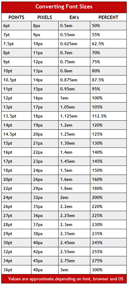
And finally this is an wonderful chart from Kiosk Tutorials helping us to do a comparison among these four units.

Updated: Other related great articles (collected from my LinkedIn group discussion ;) ):