In general, I don’t like taking buses to work, because the journey could be bumpy and you can’t really do anything except listening to music or an audio book. I may get dizzy if I look down at the phone or read a book. I almost always feel bored on a bus.
The other day, I had to take a bus. It was pretty full at a glance, so I grabbed the first seat I saw — the one right behind the driver.
On the driver’s right hand side, there are two devices. The upper one looks like a touch screen; the lower one has a lot of interesting physical buttons, and is connected to the cash machine. I really wanted to take a picture, but thought snapping one from other people’s back was too creepy. Therefore, I pulled out my iPad and sketched them out.

Well, I wasn’t bored at all this time, because I was trying to reverse engineer how the devices worked, during the entire trip. Unfortunately, the driver didn’t really use them, so I didn’t get a chance to learn about how they functioned in further details.
First impression of the devices — they satisfy a bus driver’s needs, but look mysterious.
Device at the top:
- Touch screen, user interface elements look fairly simple, straightforward but overall ugly.
- The information and buttons can probably be better organized, and buttons can be given better affordances. Generally, buttons have a yellow or green background color, information has a a gray background color. I noticed one piece of information can change its background color from yellow, green to red. Some information and buttons share the same color, which may have a chance to get users confused.
- Different font sizes are applied to different types of information. “Next stop” is the biggest, then the bus number and its overall destination, “next 3 stops” are in tinniest size. It seems to me a logical way of organizing the info. I need to learn more about what bus drivers care about, so that I can if there’s a better way to organize them.
- It indicates “off route” if the bus is going off the original route. There must be some GPS tracking with this bus.
- It’s hooked up to the cash machine, so I assume the info displayed on the device somehow relates to cash people put in.
- This device has a lot of interesting buttons, arrows, numbers, limited number of letters, a blue button and a green button. I was really curious about their functions, but unfortunately, the bus driver didn’t use them at all during my trip. Maybe they’re useful if someone buys bus ticket using cash? Everyone on bus used a transportation card, no cash was used. Maybe it’s a good thing that this machine is not used, as people would rather use a more convenient way to pay for bus fare.
- The interface details to current time. It changes to cash amount when the bus door is open, but quickly switches back to time once the door is closed.
One of the most interesting aspects of the upper device is the time of delay. Look at the “-11 minutes” area.
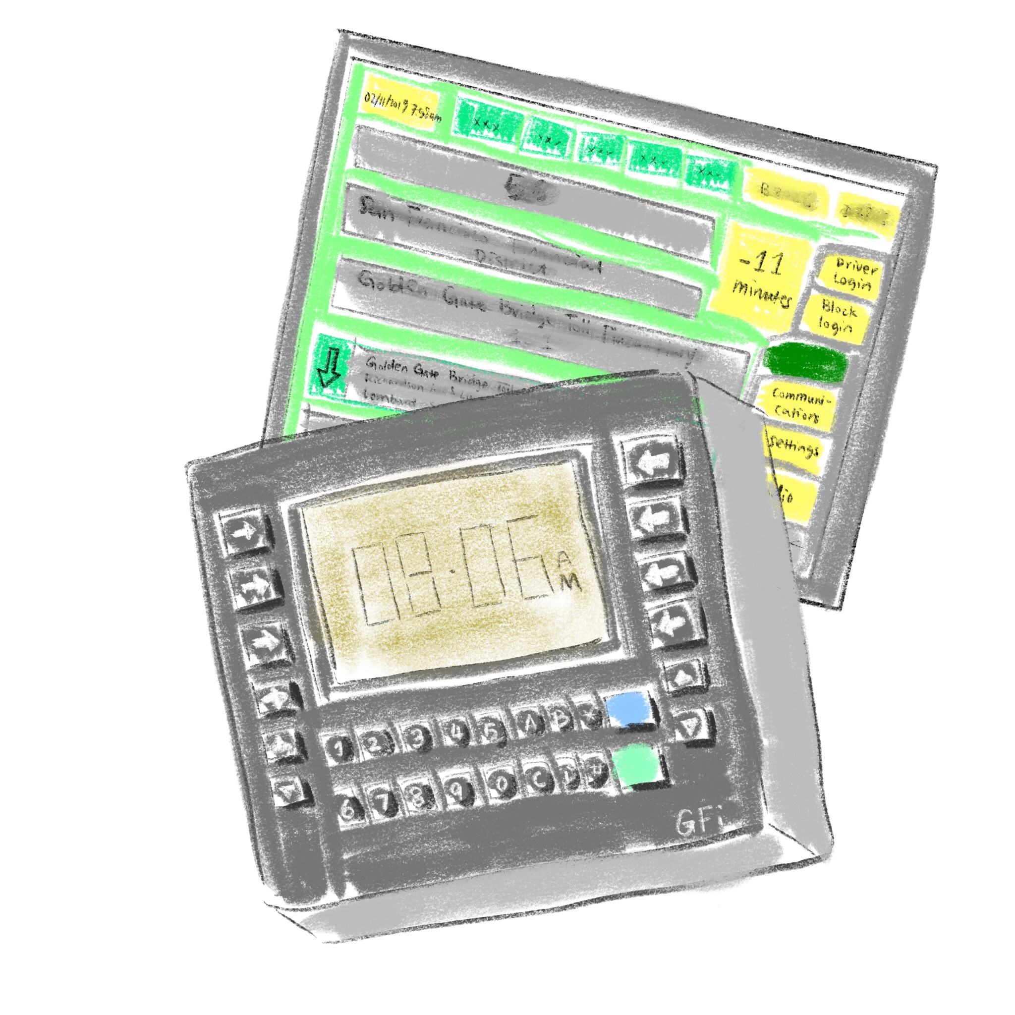
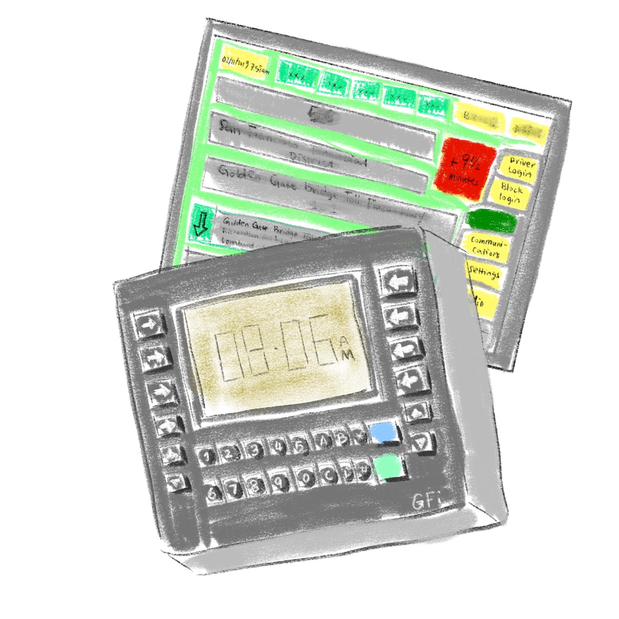
- The area is green, the bus is accurately on time (within a time range)
- The area turns yellow if the bus is way behind schedule
- The area turns red if the bus is ahead of schedule
The use of color here piqued my interest. Why red?
Red in interface design generally indicates there’s some negativity, think alerts, warnings. I’m not too familiar with how bus drivers read the information — maybe it’s more important to know when a bus is ahead of schedule rather than behind? Buses can’t wait for passengers in normal stops, and that means if a bus comes earlier than scheduled, people arriving on time at the stop will miss the bus. That’s my guess, of course.
Overall, it’s really interesting to look at devices that I had no knowledge of, and trying to figure out how they work. Next time if I get the opportunity to sit close to the driver, I will chat with them about the devices.