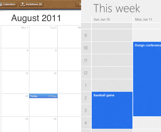
I came across this excellent article about Apple’s highly textured and ornamented design (so-called “Skeuomorphic”) and Windows 8’s flat design. Apple tries to simulate real world objects and textures in its apps, such as iBook, Calendar, Notes; and in contrast, Microsoft tends to make interfaces look more flat and digital by removing every bit of adornment from its latest UI.
Personally, I hope the digitized world looks somewhat different from the real one. I do love the visual effects when you turn to next page in iBook, and can imagine how much effort engineers have put into it – but I prefer turning pages in a real book.. I am a big fan for real books (does this mean I’m old school in this Internet Era though??). But of course, Apple has set nice and delicate design standards since iPhone was born (or even earlier).
However, Microsoft seemed to have created another wave of design style change. Some people laughed at the big squares when Windows Phone was out, but the flatness becomes fashionable and the design trend somehow.
My thoughts: To be skeuomorphic/flat, or not to be; that is not a question. No matter what design style we want to apply to a product, it’s important to find a best-fit style for a particular product. And do not overdo it.
Read The “whatever design” manifesto by Ben Dansby